Hi there Scrap Matrixes!!
Tam here today....
I've popped in today to share the details of my first creation for the 'Limited Supplies' Challenge.
Here it is.....
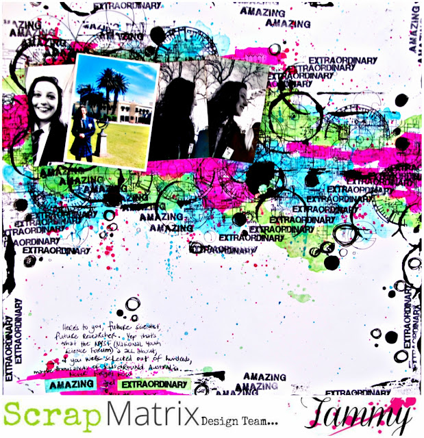
Love that colour against the white, with the touches of black thrown in!
This layout celebrates my girl's recent achievement to attend NYSF in Canberra (the National Youth Science Forum). This is a highly sought after trip with applications from all around Australia.
I was so excited for her when we found out!
She got recognised at Government House and sponsored by Rotary plus achieved a scholarship.....so she is off on a trip of a lifetime, to discover all things STEM based!
Not too bad for a young girl from little old Clare!
Anyway, time to stop bragging, and get on with the layout.....
This month, the design team all received 5 supplies in the post, and the idea is to play with only those, adding the bare minimum.
We each received 2 paints, a spray, a stamp and a stencil.
So here's the supplies I received:
We each received 2 paints, a spray, a stamp and a stencil.
So here's the supplies I received:
Now the first thing I was relieved about was the colours - nice and bright. My only dilemma - the stamp and stencil had a more 'boy/grunge' feel, and the colours had a more 'girly' feel.
Yes I know......no such thing!! But it had my brain freaking out for a while.
So I decided to focus on the stamp and stencil.
They have a bit of a science/maths feel to them - and then the idea struck!
My girl and her Science achievement! YES
Suddenly I had direction.
Besides a bit of black paint, black ink and black pen and thread, the only other thing I added was a white background paper. THAT's IT!!
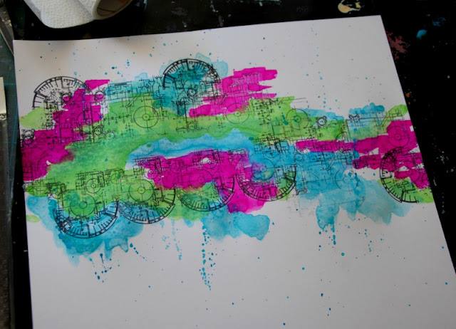
So I began by stamping directly onto the paper - time to make my own patterned paper.
Don't be too fussy if the stamping isn't perfect......that just adds to the effect.
I then added the 'Funky Fuschia' Ink Spray - instead of spraying it on, I opened the bottle, and applied it with a brush. I applied it randomly in a few spots.
I then went back in with the 'Ocean' by Dina and the 'Cut Grass' by Dylusions.
NOTE - I added a lot of water to these.....until I achieved a transparent, almost watercolour feel.
I didn't want to cover up all that stamping.
I then added some black paint using a sponge and the 13Arts Stencil.
Just a few pops here and there.
I felt it needed more black, and I wanted to continue the circle theme, so I grabbed the end of an old paper towel cardboard roll, and used this as a stamp by adding black paint.
I then used an old credit card to swipe the black paint around the edges.
I love the grungy look this gives.
Finally I used the word stamps within the AALL & Create stencil and randomly stamped them in clusters.
You may also be able to see that I used the 13Arts stencil to create little traced elements that are peeking out in the background. This just adds another layer and more texture to the page.
I printed off 3 of my photos in black and white. I decided to print one in colour, as the colours matched the paints perfectly, and also it would create a focal point.
When printing a number of photos for a layout, it's important to keep one as a focal point, so the eye is drawn into the layout - it gives the eye somewhere to focus, and adds to the overall flow of the layout.
At this point, I decided a title wasn't necessary - those stamped words kinda created the title for me.
So I added some journaling to the bottom of the layout, making sure to include those repeated words. This 'pulls' the whole layout together, and helps to highlight those words as the title.
I finished off with a few pen scribbles - again in circles.
Man, it was hard not to add tags and word stickers and all the gorgeous stuff I normally do. BUT I DID IT!! I had to walk away as my hands were itching! But when I came back, I liked what I saw.....do you ever do that? I do, so often - I take a break, go hang out the washing or something and come back with fresh eyes.
You will often then 'see' something that needs to change. Something that you were blind to before.
Another little trick is to take a photo on your phone and look at it that way.
Somehow it focuses your eye and gives you a renewed clarity.
Well that's it from me today.....the proof that LESS really is MORE.
Working with limited supplies forces you to be more creative, forces you to think outside the box.
So what can you create with a couple of paints, a stamp and a stencil???
How creative can you get with a limited supply of products? Can you make less into more? Whether you are art journaling or scrapping, we can sometimes get overwhelmed with the idea of how much stuff to use... so this challenge is about stripping it back, using less and stretching your supplies in different ways.
How creative can you get with a limited supply of products? Can you make less into more? Whether you are art journaling or scrapping, we can sometimes get overwhelmed with the idea of how much stuff to use... so this challenge is about stripping it back, using less and stretching your supplies in different ways.
Head on over to our Scrap Matrix Shares Facebook Group and load up your creations, including what products you used.
We love seeing them. Your creativity inspires us so much.
PLUS you could win a voucher from the shop or a chance to be a guest designer!!! Woohoo!
We love seeing them. Your creativity inspires us so much.
PLUS you could win a voucher from the shop or a chance to be a guest designer!!! Woohoo!
I'll be back again real soon.
Love Tam
xxx
Scrap Matrix Products used:


No comments:
Post a Comment