Showing posts with label Dylusions Inks. Show all posts

Sunday, 3 February 2019

Limited Supplies.....with Tam

Hi there Scrap Matrixes!!
 
Tam here today....
I've popped in today to share the details of my first creation for the 'Limited Supplies' Challenge.
 
Here it is.....


Love that colour against the white, with the touches of black thrown in!


This layout celebrates my girl's recent achievement to attend NYSF in Canberra (the National Youth Science Forum).  This is a highly sought after trip with applications from all around Australia.
 
I was so excited for her when we found out!
She got recognised at Government House and sponsored by Rotary plus achieved a scholarship.....so she is off on a trip of a lifetime, to discover all things STEM based!
 
Not too bad for a young girl from little old Clare!
 
Anyway, time to stop bragging, and get on with the layout.....


This month, the design team all received 5 supplies in the post, and the idea is to play with only those, adding the bare minimum.
We each received 2 paints, a spray, a stamp and a stencil.

So here's the supplies I received:


Now the first thing I was relieved about was the colours - nice and bright.  My only dilemma - the stamp and stencil had a more 'boy/grunge' feel, and the colours had a more 'girly' feel.
Yes I know......no such thing!! But it had my brain freaking out for a while.
 
So I decided to focus on the stamp and stencil. 
They have a bit of a science/maths feel to them - and then the idea struck!
My girl and her Science achievement! YES
Suddenly I had direction.

Besides a bit of black paint, black ink and black pen and thread, the only other thing I added was a white background paper.  THAT's IT!!
 
So I began by stamping directly onto the paper - time to make my own patterned paper.


Don't be too fussy if the stamping isn't perfect......that just adds to the effect.


I then added the 'Funky Fuschia' Ink Spray - instead of spraying it on, I opened the bottle, and applied it with a brush.  I applied it randomly in a few spots.
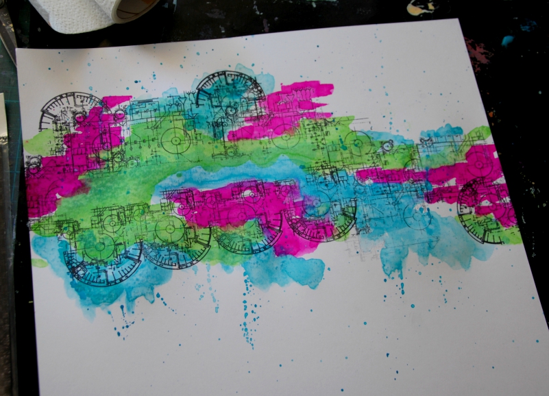


I then went back in with the 'Ocean' by Dina and the 'Cut Grass' by Dylusions.
 
NOTE - I added a lot of water to these.....until I achieved a transparent, almost watercolour feel.
I didn't want to cover up all that stamping.


I then added some black paint using a sponge and the 13Arts Stencil.
Just a few pops here and there.


I felt it needed more black, and I wanted to continue the circle theme, so I grabbed the end of an old paper towel cardboard roll, and used this as a stamp by adding black paint.


I then used an old credit card to swipe the black paint around the edges.
 
I love the grungy look this gives.


Finally I used the word stamps within the AALL & Create stencil and randomly stamped them in clusters.


You may also be able to see that I used the 13Arts stencil to create little traced elements that are peeking out in the background. This just adds another layer and more texture to the page.

I printed off 3 of my photos in black and white. I decided to print one in colour, as the colours matched the paints perfectly, and also it would create a focal point.


When printing a number of photos for a layout, it's important to keep one as a focal point, so the eye is drawn into the layout - it gives the eye somewhere to focus, and adds to the overall flow of the layout.


At this point, I decided a title wasn't necessary - those stamped words kinda created the title for me.
 
So I added some journaling to the bottom of the layout, making sure to include those repeated words. This 'pulls' the whole layout together, and helps to highlight those words as the title.


I finished off with a few pen scribbles - again in circles.
 
Man, it was hard not to add tags and word stickers and all the gorgeous stuff I normally do.  BUT I DID IT!!  I had to walk away as my hands were itching! But when I came back, I liked what I saw.....do you ever do that?  I do, so often - I take a break, go hang out the washing or something and come back with fresh eyes.
You will often then 'see' something that needs to change. Something that you were blind to before.
 
Another little trick is to take a photo on your phone and look at it that way. 
 
Somehow it focuses your eye and gives you a renewed clarity.


Well that's it from me today.....the proof that LESS really is MORE.
Working with limited supplies forces you to be more creative, forces you to think outside the box.
 
So what can you create with a couple of paints, a stamp and a stencil???
How creative can you get with a limited supply of products? Can you make less into more? Whether you are art journaling or scrapping, we can sometimes get overwhelmed with the idea of how much stuff to use... so this challenge is about stripping it back, using less and stretching your supplies in different ways.


Head on over to our Scrap Matrix Shares Facebook Group and load up your creations, including what products you used. 
We love seeing them. Your creativity inspires us so much.
PLUS you could win a voucher from the shop or a chance to be a guest designer!!! Woohoo!
 
I'll be back again real soon.
 
Love Tam
xxx


Scrap Matrix Products used:


Monday, 3 December 2018

Tam just had to go with ALL of the colours!!

Hi there Scrap Matrix lovelies.

My turn (Tam) to share my creation for the current 'Colour Wheel Challenge'. 
What a challenge!!
As soon as I saw it, I did a major happy dance.....totally up my alley!

I ADORE COLOUR!

Of course, I just HAD to go with some sort of rainbow layout.


When I think of colour, and what Inspires me, I immediately think of my babies.

They bring ALL of the colours into my life. 


So I began by adding white gesso to white cardstock.


I then grabbed my favourite sprays....Dylusions Ink Sprays.  I just love their vibrancy.

So I began by adding some colour to the background.
Instead of spraying them on (too stressful - they go everywhere!), I opened them and applied with a paintbrush.


I added water and then let it run down the page a little.  This gives a gorgeous watercolour finish to the bold ink.

A couple of tips.....

WAIT for each colour to dry before adding the next colour - this will give you that distinct rainbow effect. Otherwise you run the risk of them blending and changing colour - I want colour, not mud!


My second tip is to copy the rainbow pattern ROYGBIV - it's fine to leave out a colour but going in that order is pleasant to the eye - that gorgeous natural wonder the rainbow does the work of contrasting/complementing the colours for you.  Don't mess with what is already perfect.


Once completely dry, I added a few flicks of the colour too.

I used the following colours:
Red - Dylusions Ink Spray - Postbox Red
Orange - can you believe I didn't have an orange Ink Spray, so I grabbed my Prima Watercolours in 'Tropical' and used the orange from that. You really can't tell the difference, so if  you don't have Dylusions Ink Sprays, using watercolour instead will totally work!
Yellow - Dylusions Ink Spray - Lemon Zest
Green - Dylusions Ink Spray - Vibrant Turquoise
Blue - Dylusions Ink Spray - Calypso Teal
Purple - Dylusions Ink Spray - Crushed Grape

That's the background done. So EASY!

Recently I had a bit of a spending spree on the new amazing Carabelle Stamps.

I couldn't go past this gorgeous flower stamp....


I stamped some onto white cardstock using an archival ink.

I wanted to add colour, so needed the ink to stay put and not run.


I then grabbed the Prima Watercolours in Tropical again and applied colour.

I focused the stronger colour on the centre of the flowers and let it fade off on the outer parts.


They look pretty average like this, but once cut out they are gorgeous!!


SEE!!

Anyway, back to the layout....

We took this photo recently.....yup a selfie, and I knew immediately I wanted to print it in both black and white and colour.  I just loved the contrast, and decided to print two more black and whites and create a multi photo layout.  Yes they are all the same photo - but you could easily use 4 photos in a series for this too.

As soon as I looked at the series, my title just came to me.....you colour my world!

I used the Tim Holtz Ideaology stamps to add the word 'colour'.


I then added in some Tim Holtz Ideaology small talk stickers.....


I added some of the paint splatters from the 7Dots Hazy Days Stamps in black ink.  LOVE this stamp so much.

I used both the large splatter and the fine splatter.

I ensured some were overlapping and some were hanging off the page.


I just love how those flowers look..... I made sure the colours matched the background.


I added in some 7Dots Word Stickers and also a few of the Mambi Chips - to the centre of the flowers.  They just completely finished it off!


The final step.....JOURNAL!!!

Doesn't have to be a lot, but ADD it!


I love how this turned out!!


I'd love you to give it a go!

Here's a look at the 'Colour Wheel Challenge'. How can you not be inspired by this?!?!


You can win a Scrap Matrix voucher - Vicki has the bestest stuff!!
You could also win a Guest DT spot! How cool to come and play with us!!!

Just head on over to our Facebook shares group, and add your entry into the challenge album.  Don't forget to let us know which Scrap Matrix product/s you used!
Yep it's that easy!

I can't wait to see what you do!!
Bonus points from me if you try this technique! LOL!
 
If you'd like to see more of my colourful work head to my blog HERE


Scrap Matrix Products used:
White Bazzill


Friday, 5 October 2018

"Take Note" By Monique

Good morning all, Monique here.  I am popping by the blog today to share with you my first layout for this month's "You've Got Mail" challenge.

This is another fantastic challenge - the choice for interpretation is endless!

For this one, I decided to use this really cool chipboard from the 7 Dots Studio Airmail collection.  The postage stamp frames, envelopes and other little chippy shapes are really cute!!

I wanted to create a layout about this photo I took of my son recently.  He is growing up so fast - literally changing into a young man before my eyes.  I wanted to tell him how proud I was of the young man he was becoming.

Anyway, this is what I did:

I also took the opportunity to use some new awesome Paper Artsy Star Stamps.  I coloured them with a technique I picked up from the lovely Tammy Klingner.  I just sprayed some Dylusions Ink Spray in Postbox Red onto the stamp packaging and splodged it onto some white cardstock.  I then dried it with a heat tool and did the same with some Dylusions Ink Spray in London Blue.  Once it was dry I stamped on my stars using archival ink, cut them out and backed them with some black cardstock to make them "pop" a bit more.  Here is a close up of how they turned out:


Next I got out the 7 Dots Studio Airmail - Chipboard and painted it in some Dina Wakley Media Acrylic Paint - Black.  Once it was dry, I doodled an outline on them using a white gel pen.
Finally, I got out some new MAMBI chips I was itching to use and added them to my layout as well. These chips are amazing - I use them on so many projects.  They can be used for titles to, which I love.  This particular pack is currently sold out in the shop, but there are so many different packs to try - and they are all equally amazing. They can be found here.
 I also drew around the stars and the MAMBI chips with a white gel pen to tie all my embellishments together.

Here are some more close ups of my embellishments:


Thank you for popping by today, I am so looking forward to seeing all your fabulous "You've Got Mail" creations.  Don't forget if you want to enter, simply upload your work - mentioning at least two Scrap Matrix products you've used - to the "You've Got Mail" folder at the Scrap Matrix Shares Facebook page.

The products I've used that are available in the Scrap Matrix Shop are linked below.


Bye for now, and happing creating!