Wednesday, 23 January 2019

2019 - Make Time to Enjoy by Elisa Ablett

Hi everyone,

My turn up on the blog today with my second share of the month, 
based on the challenge for January 'A Year in Review' 

Instead of sticking with 2018, i was inspired by the word reflection in the challenge graphic. 

I thought about writing myself some 'things' I would like to take the time to enjoy in 2019.

After a busy and somewhat turbulent year in 2018 for myself and my family, I decided to concentrate on what I thought would make my heart sing in 2019.

After brainstorming and a bit of Pinterest scrolling through Art Journalling, Inspirational lists and Bible Journalling posts, I came across a few inspiring pieces.

I wanted to journal on half of my page and I love colour, so with a bit of inspiration from a project from Pinterest ( Author Unknown - so if you see it let me know so i can give credit where credit is due) and a design in mind, i set about creating my art journal page.

No photo description available.


Here are the products used from Scrap Matrix:

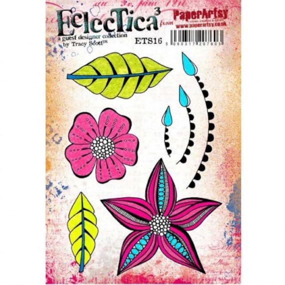
Eclectica ETS21Image result for Paper Artsy Stamps tracy scott

6x6" 13 Arts - Triangles - Color Basic
AALL Stamp set #8


http://scrapmatrix.com/dina-wakley-heavy-body-acrylic/

Here are some close ups of the finer details!


That's it from me today, I hope I have inspired you to write a 'to enjoy' list for this year.

Hugs

Elisa xx


Tuesday, 22 January 2019

Scrap Matrix January 2019 Challenge - a second project with Helen

Welcome back to the Scrap Matrix challenge this month 
where we have an eclectic mood board to inspire you.


You can take this challenge pretty much where ever you want;
 it's so versatile.

Once again, the team has been invited to to use multiple photos,
so I specifically took heaps of shots on Christmas day.


I decided to keep it simple & create frugally as I did years ago.  
One sheet of paper and a few scraps is all I used.

I'm such a fan of this paper collection, 7 Dots, paint chip collection, "Aquarmarine" 
 What better for photos at the beach.


To partially frame the photos, I cut some contrasting scraps of paper, 
using some old dies from my stash.

The titles and stars are all from a Pink Fresh Studio, 


It was lovely to see the Cousins enjoying each other's company.
The Photo App tag is from Mambi chips, "Vacation". 


I used the Carabelle stamp, "Bulles d'eau",  because it reminds me of the bubbles 
in the sea, the champagne we drank and the effervescence of the children.
I randomly stamped the bubbles with 
White ink from my stash.

  
Here, I'm trialling the elements in various places on the paper. 


I decided to type my journalling on white card stock, so that it would stand out from the background. But then it looked too stark, so I pulled out some Tim Holtz distress Oxides.


Testing how the colours blend and checking that they will look OK on the background.   
I keep these little test swatches with the Oxides 
in case I need the same combination later on.


Before I separated the lines of text, I smooshed the card stock through the Oxides and dried it with a heat tool.


Later I flicked on a bit of extra green Oxide paint.

I'm happy with this photo journalist style of page, it narrates the Joy of the moments in an inexpensive and simple way.

How about you, do you have a group of photos you'd like to get scrapped?   I hope you've found some inspiration here and will play along.

Just add your entry to the Scrap Matrix Shares page, in the corresponding folder and don't forget to let us know what Scrap Matrix products you used and what inspired you.  You could be in the running for a generous gift voucher and perhaps a Guest Design Team spot down the track.

Sunday, 20 January 2019

A year in Review - Second layout by Lynn

Hi everyone, today I am sharing with you my second layout for this months challenge - A Year in Review.

This months challenge has really brought home to me about why we started scrapbooking and the importance of taking photos and also making pages of our memories.

I have done another double layout and included photos that have been miles stones this year


I have used the 13 arts paper collection - Strength in Numbers - designed by the awesome Australian Fiona Paltridge.  

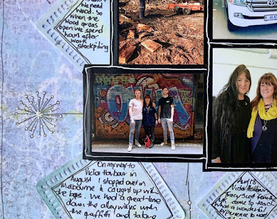
Around the background I have stamped randomly with the Paper Artsy stamp EKC07.  

I have die cut squares from the 6 x 6 pages of the Strength in Numbers Collection, which I have put under each photo and journalled about that photo.

Here are some close ups:


There is still time to enter into this months challenge - all you have to do is upload your layout, card, project, canvas onto the Scrap Matrix Shares Facebook page and tell us at least one product that you have used that is available in the Scrap Matrix Shop.

Products I have used:


Saturday, 19 January 2019

Art and books - what more could a girl want?
By Tammy Klingner

Hello!
 
Tam back again to share a special project with you, something I've been working on for a while. I've been busting to show you all, and it just fits perfectly with this month's challenge, 'A Year in Review'.
 
One of my other passions in life is reading. Aaaah books! I love books. I love the feel of them, the smell of them, the look of them. I love escaping reality, I love that I can live different lives, understand different perspectives.
 
Earlier this year, I began a book club, and after each book is read we have a few questions to answer. I love that these questions make me think more deeply about the book. They make the book stay with me for quite some time afterwards.
So the storyteller in me wanted to document this, and the way I express myself is with colour and paint, so I decided to begin an art journal focusing on the books I've read.
 
I began with a gorgeous old book that I had bought at an op-shop - it's pages were tattered and had a lovely texture to them. The only problem was the pages were very thin - so I began gluing pages together to 'toughen' them up a little. Now I had the base for my project, so time to delve in and have some fun...........


'Breath' by Tim Winton
I was inspired by the surf, the waves, the ocean.


'The Light we Lost' by Jill Santopolo
I was inspired to create a city scene as New York was pivotal to the story.


'The Nightingale' by Kristin Hannah
I was inspired by Isobel, one of the sisters who became known as 'The Nightingale' during World War 1 for her heroic deeds.


'On the Island' by Tracy Garvis Graves
I was inspired by the Island Imagery and the sunsets.


'A man called Ove' by Frederik Backmann
I drew inspiration from a quote about colour and the neighbourly love and support.


'The Dry' by Jane Harper
I took inspiration from the Australian bush.


'Eleanor Oliphant is Completely Fine' by Gail Honeymoon
I tried to capture Eleanor and her loneliness.


'Circe' by Madeline Miller
This book has a glorious cover which became the starting point for this one.


'The Nowhere Child' by Christian White
I wanted to recreate the woods and the darkness.


'Little Fires Everywhere' by Celeste Ng
This book contained a lovely reference to feathers which became the inspiration for this one.


 'The Wife between Us' by Greer Hendricks and Sarah Rekkanen
I wanted to capture the two women central to the story.


'Room' by Emma Donoghoe
This book is written from the child's persepective, so I drew a childlike image, using my left hand and lots of stamps.


'The Lace Weaver' by Lauren Chater
I was inspired by the lace, the history and the rings mentioned throughout the story.


'The Bookshop of the Broken Hearted' by Robert Hillman
This one had me stumped, so this kinda just happened.


'I See You' by Clare Mackintosh
Pretty self explanatory!


'Baby Teeth' by Zoje Stage
This was an interesting read, and contained a quote about butterflies which I loved.
 
As you can see,  they all vary, and some are simpler than others.
I always used colour as an inspiration......what colours/mood did the book create in my mind?
Sometimes I added quotes, sometimes I jotted down my thoughts.  I really just went with the flow each time, let it evolve, tried not to overthink it.
I just let the inspiration take over.

Such a fun project - lots of playing and experimenting.  I'm never really worried about the end result, it's more about the process and the documenting.
 
Oh and another thing - this book does NOT cope with what I throw at it, unlike the gorgeous Art Journals available from Scrap Matrix that can take anything I hurl at them - this book doesn't cope at all. I really only get one chance - the pages tear really easily if I add too many layers or try to remove any paint.  At first I struggled with this, but I really love that it forces me to just go for it, enjoy it and then move on!! I also love that the text/written words are visible through the paint....really adds to the whole concept.


This is a look at the book - one day I will jazz up the cover!
 
There's too many Scrap Matrix products used on these to list them all, so I'll add a few that I go to over and over again.
But basically use ALL of your paints! ALL of your stencils and ALL of your stamps!!!
 
I can't wait to keep adding in pages as I finish reading books.
 
I hope you've enjoyed this post, I'd love to hear what you think.
 
I can't wait to see your entries over at the Scrap Matrix Shares Facebook Group.
Just pop your creative project into the 'Year in Review' Album and let us know in the comments what Scrap Matrix Products you used.
You could do a layout, a canvas, an art journal page, a calendar - whatever you like!
You could win a voucher from Scrap Matrix - you can then stockup on stencils, stamps and paints!
You may even get to be a Guest Designer!

Here's the inspiration:


Until next time,
 
loads of colourful hugs,
xx