Showing posts with label Petaloo. Show all posts

Saturday, 22 September 2018

Living life .. with Alz

Morning peeps!

I'm here to share another "You've been framed" layout with you ..
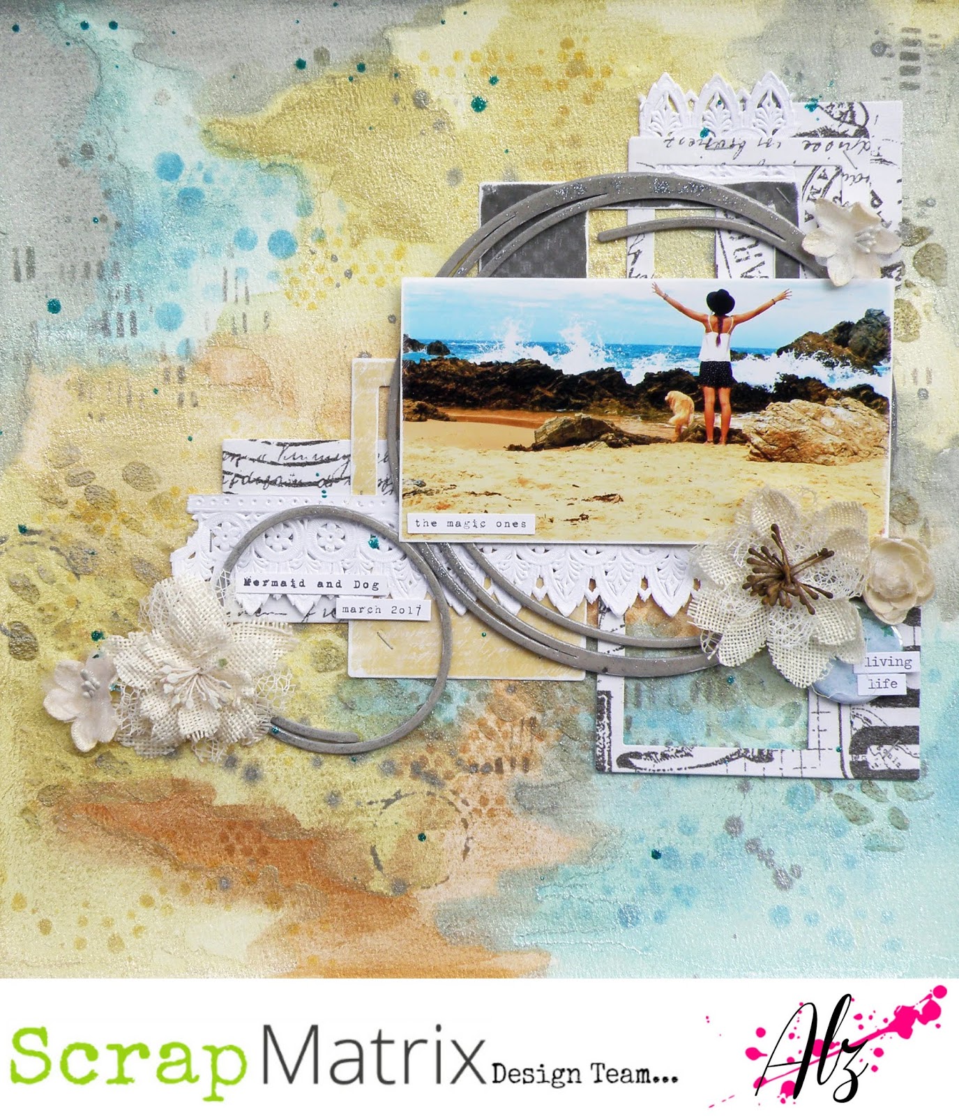
Living life


I had a ton of fun creating the background for this layout. It was a bit of an experiment with a new product (new for me that is) for adding colour and I wasn't at all sure how the colours would turn out. With a bit of blind faith, and a lot of Prima Metallic Accents Semi Watercolour Paints I made this ..

(I used a sheet of 12x12 heavy weight watercolour paper)

I love the way the colour has seeped into the watercolour paper whilst the mica powder has stayed on top, giving a kind of blended but opaque finish at the same time. Super cool!

Whilst this was drying, I played with the idea of leaving the background as it was to show off the beautiful colour, shimmer and shine, or to add more layers. In the end, more is always more, lol, so I grabbed some stencils (many stencils!) and my Tim Holtz Distress Inks (Mustard Seed, Scattered Straw, Tumbled Glass, Pumice Stone, Tea Dye and Broken China) and using (mostly) like colour on colour, went to town.


So I'm digging this, but it needed more because, well, more is always more! It needed texture. Something organic and beach-y. Because this was my photo ..

(I love, love, love the new Tim Holtz Mixed Media Mat!)

The Finnabair Texture Paste in White Sand with the Joggles 9x12 Wander stencil would be perfect, or so I thought.

But, once dry, now you see it ..
and now you don't ..
.. which was a bit of a nuisance cos I wasn't going for 'subtle' lol!
(Oh and this depended on the angle from which you were looking at the background.)

What to do la? It'd been a while since I played with my Faber Castell Gelatos so figured 'why not?'. Using Gold Champagne and Silver Ice from the Metallics pack, I placed the Joggles stencil back over the White Sand Texture Paste and smeared the Gelatos on top of the texture paste with my finger and once dry ..

now you see it ..
and now you don't now you still see it ..
magic! (lol)

That was my background done and dusted.

I knew I wanted to use polaroid style frames and chipboard circles to create a layer of frames behind my photo. Because I couldn't cut in a straight line if my life depended on it, I decided to die cut some frames using both 13@rts Colour Basics patterned paper from the 6x6 pad and Tim Holtz Idea-ology tissue paper which I adhered to white cardstock to give it some substance. Although the tissue paper I used is currently not in store, you could just as easily use the Botanical Collage Paper.

For my chipboard circles I used Blue Fern Studios Graduated Circles, the largest of which measures 11" across. The smallest, which I've used on this layout, measures 3" across. In all, you receive five funky circles in the one pack. Oh and I also used the 6" circle on my layout.

(cool huh?!)

I inked both circles with the Pumice Stone Distress Ink, coated them with Ranger Glossy Accents and, whilst wet, sprinkled on some Prima Art Sugar Glitter in Antique Silver. I stapled my paper frames to my background, glued down my chipboard circles, added White French Lace Embossed Paper Lace, and that was my layers done.

ps: if you check out my yellow polaroid frame you can see
that I can't even die-cut in a straight line lol!!

As you probably know by now, I love using flowers on my layouts. This one would be no different and, luckily for me, Petaloo had the perfect flowers for my page .. Ivory Burlap Blossoms and Ivory Mini Paintables. I tucked a teal bloom Um Wow Flair in with a couple of my flowers and added my title "living life" using individual words from Tim Holtz Idea-ology Chit Chat Stickers on top. I printed my journaling using a free font 1942 report and I was done. Here's a few close ups of my finished page ..


Oh and by the way I forgot to add that when it was all stuck down and finished, or so I thought, I decided to flick around a small amount of Turquoise 13@rts Splash Glitter Ink!

Have you thought of playing along with our "You've been framed" challenge this month? You have until midnight on the 30th to upload a pic of your project to the Scrap Matrix Facebook Shares Page. Oh and heh don't forget to let us know which products available from Scrap Matrix you've used.

That's it for me today. I hope you're having an awesome start to your weekend.

'Til next time.

Cheers .. Alz  :)


Scrap Matrix products used:
Prima Art Sugar Glitter - Antique Silver
13@rts Splash Glitter Ink - Turquoise Glitter
Save

Sunday, 22 July 2018

You make me smile .. with Alz

Morning peeps!

I'm baaaaaaack. Okay so this is my third post this month. I know I know lol, but I couldn't help but create another layout with this month's challenge!

You make me smile

A quick reminder of this month's fabulous moodboard challenge Love is sweet ..


I've already created a layout using pink which was inspired by the baby photo, and a layout focusing mostly on green with some neutral elements. This time I was inspired by the yellow, albeit a softer yellow, and the shape of the macaroons. The layout came together super quickly, so I'll keep this super quick. Well, lol, at least I'll try.

I created my background on patterned paper from the Maja Design Coffee in the Arbour collection. Three quick steps and it was done. Literally. Using the masking technique I've shared before, I stamped some circles from a Blue Fern Studios stamp setTexture Circles with a Tim Holtz Distress Oxide Ink in Antique Linen. I gave that a quick blast with a heat gun before applying Ranger Texture Paste through a TCW Stencil12x12 Tiny Circles. Judging by how grungy my stencil is (oops), I'm going to hazard a guess its my favourite. lol. Once that was dry I flicked around my absolute favourite product of all time, irResistible Spray. I've used the Desert Sand and OMGee it is divine. It looks like toffee and I can't hardly wait to use it on kraft cardstock as I reckon it'll look sensational. Moving on (lol).

Next, I stamped some circles from the Blue Fern Studios stamp setTexture Circles on another sheet of patterned paper from the Maja Design Coffee in the Arbour collection. I used circle punches to cut out two different sizes .. one the original size of the stamp and the other, a smaller size. I inked the edges of both size circles to give them some definition. Oh, and I used the Tim Holtz Distress Oxide Ink, in Antique Linen, for my stamping which, again, I heat set.

I mounted my photograph with some cardboard packaging to raise it off the page and then added my stamped circles and some Petaloo Florals (Mini Paintables - Blossoms Ivory) around the photo as a mat of sorts, and also as embellishments. I added some other small bits and pieces I had sitting on my table gathering dust, and a stick pin I made (my latest obsession). I added the journaling I printed using my favourite font, 1942 report, which I found free online somewhere, and voila, I was done! I told you it was super quick. Here's a couple of close ups ..


Anyways, its time for me to step away from the moodboard (lol) and check out what you guys have been creating. Don't forget you now only have until the end of the month to upload a pic of your project on the Scrap Matrix Facebook page. Also, don't forget to let us know which products you've used from Scrap Matrix.

Til next time!

Cheers .. Alz   :)


Scrap Matrix products used:

Wednesday, 18 July 2018

Loved .. with Alz

Morning peeps!

I'm back today to share my second project for the current Scrap Matrix challenge .. How Sweet It Is.

Loved

I was inspired by the yummy pistachio-ish green and vintage-y kraft colours, the love heart and, most of all, the song lyrics "How sweet it is to be loved by you".


I knew how I wanted this layout to look, but wasn't entirely sure I'd be able to translate my 'vision' to the page. So I started experimenting with, yet again, my favourite Dina Wakley Media stamp set .. Abstract Blooms. I didn't want the stamping to be 'heavy' so used a Watering Can (instead of Jet Black)  Ranger Archival Ink to do my stamping. I like the softer look the Watering Can gives. Once I had established that the stamped images looked good on the reverse sides of the yummy (pun intended lol) Studio 75 Yummy patterned papers (I used 03 and 04), I cut them out. I did try colouring a few of the flowers but decided I was right first time around, and left them plain with the kraft colour coming through.


Incidentally, if you like to create on neutral, kraft-like coloured backgrounds, I can't recommend the Studio 75 Yummy patterned papers to you highly enough. They are a lovely weight to work with, distress well, cut through like butter, and the colours on the other side (reds and yellows) are just as yummy (again, lol, pun intended) as the kraft coloured sides. I know there are more yummy (sigh lol!) kraft coloured papers in store, but for now, let's focus on the Studio 75 Yummy ones.  ;)

Next it was time to move on with my background. As I've said above, I was really inspired by the pistachio-like, green tones in the mood board. I'm not entirely sure why. I mean I know its Tammy's favourite colour, but is it mine?? I wouldn't say so, but this patterned paper by Maja Design (drool!) from the Coffee in the Arbour collection is to die for .. Feel the Grass (I'd much rather smoke it but that's another story .. did I just say that out aloud? oops he he he!). Why do I drool over the Maja Design patterned papers? First and foremost, their weight is perfect. Just heavy enough to carry a lot of mixed media, but not so heavy to be inflexible or rigid in your album. The patterns, whilst seemingly a little shabby chic/vintage, are generally delicate and work well as backgrounds. If the pattern isn't so delicate you're pretty much assured the reserve pattern will be. They also have a white core which makes distressing a breeze. If you haven't tried them out yet, you might as well pop a few into your next order. Especially as they're on sale at the moment.  ;)

Anyways, first up I used Snow White Colour Blast Paste over a 12x12 TCW Template (Tiny Circles).  Once dry, it was just a little too sparkly for my 'vision' so I randomly ran a brayer over my page and some of those raised tiny circles. In this instance, instead of my 'go to' white gesso, I've used a Paper Artsy Fresco Finish acrylic paint in Nougat. Although I left plenty of sparkly tiny circles, it now needed a little oomph. I got my oomph by using Metallic Rub Ons. I used the gold from Kit 4. So as not to get it spread all over the page, I placed my Tiny Circles 12x12 TCW Template back on top of my page so the raised tiny circles poked through. This enabled me to be quite precise in where I rubbed on the gold colour with .. wait for it .. my finger! So quick and easy.

see how it sparkles?
ps: I forgot to take a pic of the painted background before adding the gold 
so we'll just pretend for now that there is one here yeah?
applying the gold rub on
(couldn't manage to take a picture of my grubby finger actually doing this
and hold my phone at the same time!)
the finished background (or is it???)

So I'm reckoning right about now that I've finished my background. Buuuut I figured I'd go wash the gold off my finger and make a cuppa. When I came back to my page I realised it still needed something to lift it. My absolute favourite product of the moment came to the rescue .. irResistible Spray! I used New Sprout.

Done!

The next bit was the easy bit. Some layering, embellishing, final touches and Bob's your uncle. Well actually, he's mine, or was till he passed .. lived up in Mildura with Aunty Joan (who's still with us) .. a pretty part of Victoria .. darn hot though. 

Moving on ..


I ripped some small strips off the Studio 75 Yummy patterned papers and kind of randomly stuck them down, but so they'd flow. Out came my next favourite product of the moment .. Dina Wakley Media Tissue Paper. OMGee this stuff is to die for. Here, I found it positively perfect for layering, using little torn up strips like washi tape but not, and for cutting out shapes. For this page, I've cut out four hearts, stapled them together, and then ruffled them up a bit to create some dimension. I figured out where I was going to stick down my cut out Abstract Blooms, coloured the leaves green with a pencil from the Prima Watercolour Pencils Scenic Route tin, and added a small length of Vintage Lace 5 in black and a Petaloo craft brown Doily to my layers. I also tucked in a Petaloo Botanica Mini Pistachio flower and created my title with Black Fitzgerald American Crafts Thickers. Finally, as per usual, I printed my journaling with a free font I found online called 1942 report.

A few close ups ..


Did I manage to capture my 'vision'? Yep! Well mostly. I think. Most likely by the time I finished this layout I couldn't remember what my 'vision' had been, but at least it provided me with a starting point!

Now, don't forget that Scrap Matrix has changed the dates for its monthly challenge. Our challenges now run from the 1st of the month to the last of the month. So you have until midnight on the 31st to get a photo of your layout, or other project, uploaded to the Scrap Matrix Shares Facebook page. Please don't forget to let us know the products you've used which are available at Scrap Matrix.

Well, that's it for me today. I hope you're having a great July and enjoying doing your taxes!!

Cheers .. Alz  :)


Scrap Matrix products used:
Colour Blast Paste - Snow White
TCW Template - 12x12 Tiny Circles
irResistible Spray - New Sprout
Studio 75 Yummy - 03 and 04
Ranger Archival Ink - Watering Can
Vintage Lace 5 - Black

Friday, 6 July 2018

Cherish .. with Alz

Morning peeps!

Important notice
Our challenge now runs from the first day of the month to the last!!!  :)

Today I'm sharing my first layout for the current Scrap Matrix challenge ..

Cherish
 
 
I was inspired by the soft photo of the baby in the moodboard ..


How could I not be? That baby is such a cutie patootie don't you think?? Anyways I have some photos of our friends' little girl Selina from when she was just a wee little baby. I'll be scrapping another photo of her soon and you'll see that she's grown just a tad. In fact, I think she's three now. But I'm terrible with dates and ages and stuff.

Moving on. lol. I really wanted to keep my page 'soft looking' (if you know what I mean) so decided to keep to a monochromatic colour scheme with a slightly shabby chic feel. I knew the Maja Design Coffee in the Arbour vintage pink tones would be perfect, and I love using patterned paper for my backgrounds, so used the Raspberry Cupcake. Oh and the Maja Design papers are just beautiful .. a lovely heavy weight, soft to the touch, perfect for distressing, and the patterns just sublime.

Although the Raspberry Cupcake would have been perfect just as it was, I wanted to add my own touch to the background.


I did this by applying white gesso with a brayer (you can find one in here) adding some Finnabair Texture Paste White Sand with Aall & Create stencil #10. Once all this was dry I reapplied the white gesso with a brayer over the texture paste. Then, once that was dry, I flicked on some Rose Bud irResistible spray.


I love, love, love the irResistible sprays. They dry almost glossy or even plastic-y and 'sit' on the surface as opposed, I guess, to being absorbed. Does that make sense? This colour (Rose Bud) was perfect for adding just a little pop of contrast.

Although I have other Maja Design Coffee in the Arbour papers I could have used for layering, I wanted to play with my Tim Holtz Distress Inks and Victorian Velvet was a perfect match for the Raspberry Cupcake paper. I dyed tissue paper, gauze and seam binding by squishing the ink pad directly onto them, spraying with water and working in the ink. I repeated this process several times to get the exact saturation of colour I wanted.


You can see I ended up tearing the tissue paper. Oops. I knew it wouldn't matter though as I could easily hide the tear in my layers. If you look again at my finished layout you'll notice I didn't end up using the gauze. It just didn't work. It was making the page too bulky and besides, didn't Coco Chanel say something about 'taking one thing off', meaning, I think, that simplifying things makes them more beautiful or classy or whatever?? Never mind. The gauze just didn't make it onto the finished page.

I also used the Distress Ink to colour a Chipboard doily border and Chipboard swallow. I painted the chipboard pieces with white gesso first so that I'd get the true colour of the Distress Ink shining through. Whilst the ink was still wet, I applied Glossy Accents. The Glossy Accents mixes with the Distress Ink, resulting in a lovely variegated, watercolour-like effect. I treated another chipboard piece, a flourish, exactly the same but I just wasn't happy with it and, in the end, these three pieces of chipboard on the layout were just one too many. So I left it off. But you can see it in the top right corner of a photo above. I'm setting it aside with the gauze to use on another project down the track some time.

Talking about setting things I don't use aside, a while back I sprayed a length of Embossed Paper Lace (White French Lace) with a Lindy's spray. It ended up not working for whatever project I was planning to use it on. So, I set it aside. Whilst rummaging through products to use on this project, I came across it and noticed the reverse was perfect for this layout! Bonus!

eeeek!
perfecto!

So I had my layers set and it was time to embellish. Keeping it simple, I used my chipboard pieces (duh lol!), I tied a double bow with the dyed seam binding, and added some Petaloo flowers .. Mini Paintables White Blooms and Fuchsia Botanica Minis.

I kept my journaling fairly simple; just a few words and a name and date. I printed these onto white cardstock with a free typewriter font I found online ages ago .. 1942 report. Then my title, which I also kept simple, using the word "cherish" from the Tim Holtz Idea-ology Chitchat stickers - Verbiage. Finito!

Don't forget Scrap Matrix has changed its challenge format. We now run our challenges from the 1st of the month to the last of the month. So you have until midnight on the 31st to get a pic of your project uploaded to the Scrap Matrix Shares Facebook page. Plus we'd love to know what products you've used which are available at Scrap Matrix .. I'm not alone in wanting to be inspired by your use of varying products!

Other than a few close ups ..


.. that's it for me today. I sooooooo look forward to seeing what you create for this month's moodboard challenge.

Happy crafting!

Cheers .. Alz  :)


Scrap Matrix products used:
Tim Holtz Distress Ink - Victorian Velvet
Save

Thursday, 10 May 2018

"Hold dear always" .. with Alz

Morning peeps!

I'm back to share another Tic Tac Toe Monochromatic page with you. This time I went with brown ..


Hold dear always

.. and the vertical strip on the left .. Brads (buttons or flair), Paint and Chippie Shape.    


This layout posed some challenges. First of all, brown. What was I thinking? Lol! Its not that I don't like brown. I mean crikey, I have a brown dog, and brown furniture. In fact my whole house is varying shades of brown now that I think about it. Except for some accent walls. But I digress (oops).

I created my own background on watercolour paper with various inks, stencils, stamps and 'stuff'. First, I used the same technique for sticking down dictionary paper as I used in my last project (see here). Once it was completely dry, I sprayed my page with water and started adding 13Arts Ayeeda Paint Rainbow Colour in Brown. Because I was working on a few pages at the same time, I had the luxury of allowing my page to dry naturally which meant I could allow each layer of the brown ink to dry before repeating the process, ie, spraying my page with water and adding some more of the 13Arts Rainbow Colour. By doing this, I was able to achieve, albeit not a lot, but some, depth of colour in my brown.


Of course I couldn't stop there, so I grabbed my TCW Mums Stencil and Paper Artsy Fresco Finish Chalk Acrylic Paint in Nougat and sponged the paint through the stencil onto my background. Once it was dry I felt it really needed some definition so messily outlined each of my Mums' petals, three times. I did it whilst I was 'watching' TV so it really didn't take that long. Next, I added some black texture paste through another TCW stencil. Finally, as you'll see on my close up photos below, I used various Aall & Create Stamps and a Jet Black Ranger Archival Ink to add that final touch to my background.    


As with my last share I decided against using layers behind my photo. With hindsight, a few weeks after creating my layout, I think maybe some plain white and/or cream layers would have worked well. But at the time, well yeah. Moving on lol! It was time for embellishing, one of my favourite parts of scrapping.

I sprayed various pieces of Chipboard (Circle Words Adore Italic #2 and Doily Border) with 13Arts Ayeeda Chalk Mist in Dark Brown and once dry (which took a while as chipboard is sooooo absorbent), inked the edges lightly with the Jet Black Ranger Archival Ink. Inking the edges gave the chipboard just a bit of definition helping them to stand out from the page.


I removed the 'pearl coloured' centres from some Prima flowers and replaced them with Prima Memory Hardware Glass Pearls in a dark colour. I also painted some Metal Flowers with black paint and then lightly scratched back some of the dried paint to reveal the metal underneath. In my embellishment clusters I also included some of my favourite flowers (Petaloo Botanica Minis) .. they're the perfect size for tucking in here and there, you can do so much with them, including leaving them plain, and a pack seems to last me an awful long time.

Because of the Tic Tac Toe line I had chosen, I had to include a Brad, Button or Flair. I went with an Um Wow Studio Flair. I've said it before, and I'll say it again, I love these flairs! They're just that little bit larger than your average flair, and they're just that bit flatter. I love them!!


Some of my stamping was a wee bit messy so to partially cover and distract from the particularly bad spots, I stamped some birds with Aall & Create Stamp Set #6, cut them out, coloured them with a brown pencil from the Prima Watercolour Pencils in Earth Tones, and adhered them to my page with foam tape.    


I also scattered around a few black rhinestones I cut from a strip of Molossi Crystal Lines. If, like me, you love bling, you seriously have to get some of these Molossi Crystal Lines! A packet will last you forever. No joke. Yes, you can use them as a strip, but one packet comes with five strips, and you can cut them up into smaller strips or individually as I generally do. Aaaand at the time I wrote this post, there are eight different colours in stock, including teal and pink and lime green .. sigh!    


Finally, I needed to add a title and some journaling. You'll probably notice I tend not to journal a lot on my pages. I also don't usually add large titles. I like to rely on my product to provide my title and/or journaling. For example, I could have titled this page "Adore" as that's the word being repeated on my chipboard circle. But I have a lot of pages titled "Adore". So I added some of the words from Tim Holtz Idea-ology Chit Chat stickers - Verbiage, and that was that. My second Tic Tac Toe Monochromatic layout was finished. Yay!

Don't forget you have until midnight on the 14th of May to add your entry to the appropriate album on the Scrap Matrix Shares Facebook page. Please also share with us which Scrap Matrix products you've used. Finally, because this is yet another long post, and you might need a reminder, here's the Tic Tac Toe Monochromatic board for you to have another look see at ..


I've really enjoyed the entries loaded so far and look forward to seeing more .. even yours! So get creating and have fun!!!!! Til next time ..

Cheers .. Alz  :)


Scrap Matrix products used ..
Ranger Archival Ink - Jet Black
Chipboard - Circle Words Adore Italic #2 and Doily Border
So Much Metal - flowers
Save