Showing posts with label maja design. Show all posts

Sunday, 22 July 2018

You make me smile .. with Alz

Morning peeps!

I'm baaaaaaack. Okay so this is my third post this month. I know I know lol, but I couldn't help but create another layout with this month's challenge!

You make me smile

A quick reminder of this month's fabulous moodboard challenge Love is sweet ..


I've already created a layout using pink which was inspired by the baby photo, and a layout focusing mostly on green with some neutral elements. This time I was inspired by the yellow, albeit a softer yellow, and the shape of the macaroons. The layout came together super quickly, so I'll keep this super quick. Well, lol, at least I'll try.

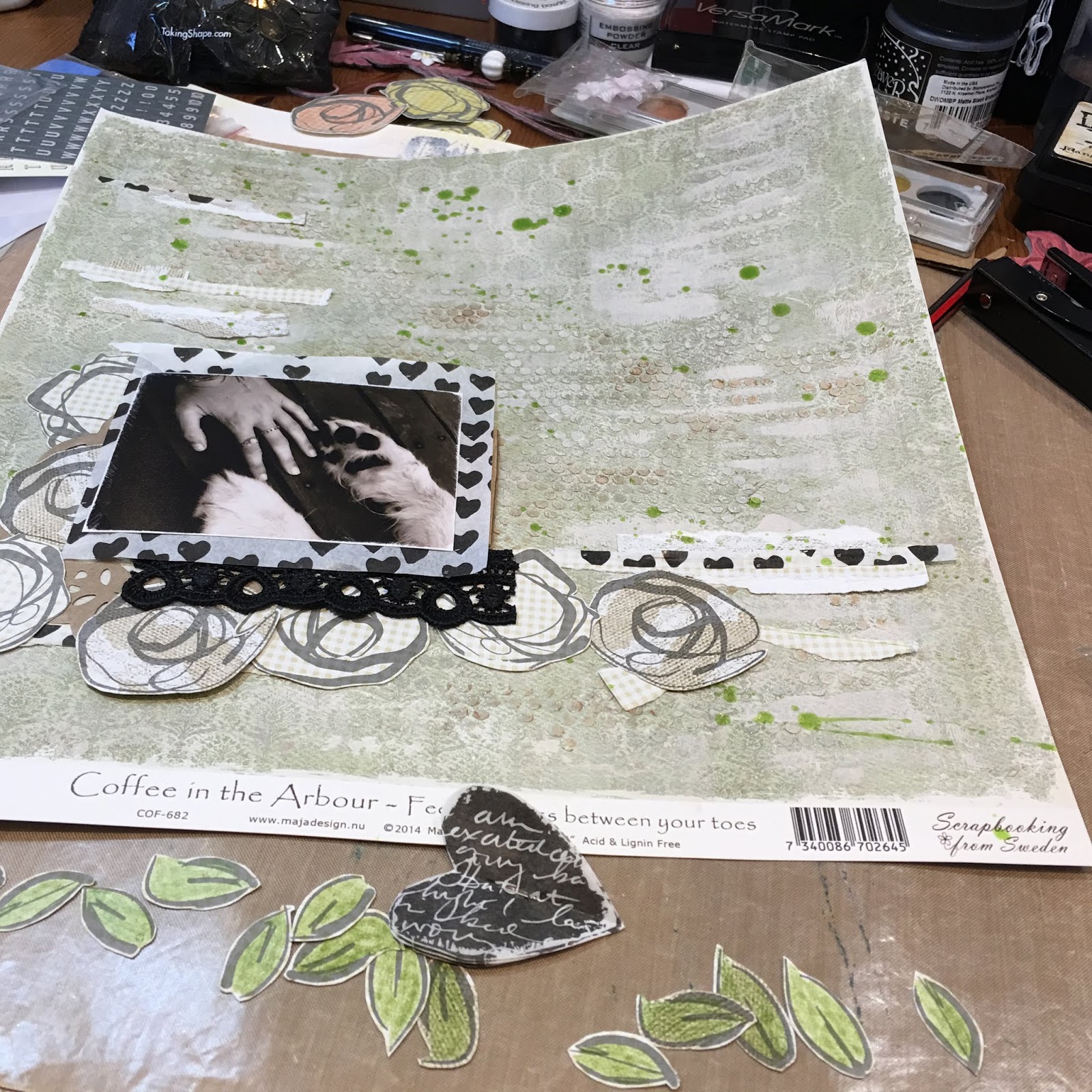
I created my background on patterned paper from the Maja Design Coffee in the Arbour collection. Three quick steps and it was done. Literally. Using the masking technique I've shared before, I stamped some circles from a Blue Fern Studios stamp setTexture Circles with a Tim Holtz Distress Oxide Ink in Antique Linen. I gave that a quick blast with a heat gun before applying Ranger Texture Paste through a TCW Stencil12x12 Tiny Circles. Judging by how grungy my stencil is (oops), I'm going to hazard a guess its my favourite. lol. Once that was dry I flicked around my absolute favourite product of all time, irResistible Spray. I've used the Desert Sand and OMGee it is divine. It looks like toffee and I can't hardly wait to use it on kraft cardstock as I reckon it'll look sensational. Moving on (lol).

Next, I stamped some circles from the Blue Fern Studios stamp setTexture Circles on another sheet of patterned paper from the Maja Design Coffee in the Arbour collection. I used circle punches to cut out two different sizes .. one the original size of the stamp and the other, a smaller size. I inked the edges of both size circles to give them some definition. Oh, and I used the Tim Holtz Distress Oxide Ink, in Antique Linen, for my stamping which, again, I heat set.

I mounted my photograph with some cardboard packaging to raise it off the page and then added my stamped circles and some Petaloo Florals (Mini Paintables - Blossoms Ivory) around the photo as a mat of sorts, and also as embellishments. I added some other small bits and pieces I had sitting on my table gathering dust, and a stick pin I made (my latest obsession). I added the journaling I printed using my favourite font, 1942 report, which I found free online somewhere, and voila, I was done! I told you it was super quick. Here's a couple of close ups ..


Anyways, its time for me to step away from the moodboard (lol) and check out what you guys have been creating. Don't forget you now only have until the end of the month to upload a pic of your project on the Scrap Matrix Facebook page. Also, don't forget to let us know which products you've used from Scrap Matrix.

Til next time!

Cheers .. Alz   :)


Scrap Matrix products used:

Wednesday, 18 July 2018

Loved .. with Alz

Morning peeps!

I'm back today to share my second project for the current Scrap Matrix challenge .. How Sweet It Is.

Loved

I was inspired by the yummy pistachio-ish green and vintage-y kraft colours, the love heart and, most of all, the song lyrics "How sweet it is to be loved by you".


I knew how I wanted this layout to look, but wasn't entirely sure I'd be able to translate my 'vision' to the page. So I started experimenting with, yet again, my favourite Dina Wakley Media stamp set .. Abstract Blooms. I didn't want the stamping to be 'heavy' so used a Watering Can (instead of Jet Black)  Ranger Archival Ink to do my stamping. I like the softer look the Watering Can gives. Once I had established that the stamped images looked good on the reverse sides of the yummy (pun intended lol) Studio 75 Yummy patterned papers (I used 03 and 04), I cut them out. I did try colouring a few of the flowers but decided I was right first time around, and left them plain with the kraft colour coming through.


Incidentally, if you like to create on neutral, kraft-like coloured backgrounds, I can't recommend the Studio 75 Yummy patterned papers to you highly enough. They are a lovely weight to work with, distress well, cut through like butter, and the colours on the other side (reds and yellows) are just as yummy (again, lol, pun intended) as the kraft coloured sides. I know there are more yummy (sigh lol!) kraft coloured papers in store, but for now, let's focus on the Studio 75 Yummy ones.  ;)

Next it was time to move on with my background. As I've said above, I was really inspired by the pistachio-like, green tones in the mood board. I'm not entirely sure why. I mean I know its Tammy's favourite colour, but is it mine?? I wouldn't say so, but this patterned paper by Maja Design (drool!) from the Coffee in the Arbour collection is to die for .. Feel the Grass (I'd much rather smoke it but that's another story .. did I just say that out aloud? oops he he he!). Why do I drool over the Maja Design patterned papers? First and foremost, their weight is perfect. Just heavy enough to carry a lot of mixed media, but not so heavy to be inflexible or rigid in your album. The patterns, whilst seemingly a little shabby chic/vintage, are generally delicate and work well as backgrounds. If the pattern isn't so delicate you're pretty much assured the reserve pattern will be. They also have a white core which makes distressing a breeze. If you haven't tried them out yet, you might as well pop a few into your next order. Especially as they're on sale at the moment.  ;)

Anyways, first up I used Snow White Colour Blast Paste over a 12x12 TCW Template (Tiny Circles).  Once dry, it was just a little too sparkly for my 'vision' so I randomly ran a brayer over my page and some of those raised tiny circles. In this instance, instead of my 'go to' white gesso, I've used a Paper Artsy Fresco Finish acrylic paint in Nougat. Although I left plenty of sparkly tiny circles, it now needed a little oomph. I got my oomph by using Metallic Rub Ons. I used the gold from Kit 4. So as not to get it spread all over the page, I placed my Tiny Circles 12x12 TCW Template back on top of my page so the raised tiny circles poked through. This enabled me to be quite precise in where I rubbed on the gold colour with .. wait for it .. my finger! So quick and easy.

see how it sparkles?
ps: I forgot to take a pic of the painted background before adding the gold 
so we'll just pretend for now that there is one here yeah?
applying the gold rub on
(couldn't manage to take a picture of my grubby finger actually doing this
and hold my phone at the same time!)
the finished background (or is it???)

So I'm reckoning right about now that I've finished my background. Buuuut I figured I'd go wash the gold off my finger and make a cuppa. When I came back to my page I realised it still needed something to lift it. My absolute favourite product of the moment came to the rescue .. irResistible Spray! I used New Sprout.

Done!

The next bit was the easy bit. Some layering, embellishing, final touches and Bob's your uncle. Well actually, he's mine, or was till he passed .. lived up in Mildura with Aunty Joan (who's still with us) .. a pretty part of Victoria .. darn hot though. 

Moving on ..


I ripped some small strips off the Studio 75 Yummy patterned papers and kind of randomly stuck them down, but so they'd flow. Out came my next favourite product of the moment .. Dina Wakley Media Tissue Paper. OMGee this stuff is to die for. Here, I found it positively perfect for layering, using little torn up strips like washi tape but not, and for cutting out shapes. For this page, I've cut out four hearts, stapled them together, and then ruffled them up a bit to create some dimension. I figured out where I was going to stick down my cut out Abstract Blooms, coloured the leaves green with a pencil from the Prima Watercolour Pencils Scenic Route tin, and added a small length of Vintage Lace 5 in black and a Petaloo craft brown Doily to my layers. I also tucked in a Petaloo Botanica Mini Pistachio flower and created my title with Black Fitzgerald American Crafts Thickers. Finally, as per usual, I printed my journaling with a free font I found online called 1942 report.

A few close ups ..


Did I manage to capture my 'vision'? Yep! Well mostly. I think. Most likely by the time I finished this layout I couldn't remember what my 'vision' had been, but at least it provided me with a starting point!

Now, don't forget that Scrap Matrix has changed the dates for its monthly challenge. Our challenges now run from the 1st of the month to the last of the month. So you have until midnight on the 31st to get a photo of your layout, or other project, uploaded to the Scrap Matrix Shares Facebook page. Please don't forget to let us know the products you've used which are available at Scrap Matrix.

Well, that's it for me today. I hope you're having a great July and enjoying doing your taxes!!

Cheers .. Alz  :)


Scrap Matrix products used:
Colour Blast Paste - Snow White
TCW Template - 12x12 Tiny Circles
irResistible Spray - New Sprout
Studio 75 Yummy - 03 and 04
Ranger Archival Ink - Watering Can
Vintage Lace 5 - Black

Friday, 6 July 2018

Cherish .. with Alz

Morning peeps!

Important notice
Our challenge now runs from the first day of the month to the last!!!  :)

Today I'm sharing my first layout for the current Scrap Matrix challenge ..

Cherish
 
 
I was inspired by the soft photo of the baby in the moodboard ..


How could I not be? That baby is such a cutie patootie don't you think?? Anyways I have some photos of our friends' little girl Selina from when she was just a wee little baby. I'll be scrapping another photo of her soon and you'll see that she's grown just a tad. In fact, I think she's three now. But I'm terrible with dates and ages and stuff.

Moving on. lol. I really wanted to keep my page 'soft looking' (if you know what I mean) so decided to keep to a monochromatic colour scheme with a slightly shabby chic feel. I knew the Maja Design Coffee in the Arbour vintage pink tones would be perfect, and I love using patterned paper for my backgrounds, so used the Raspberry Cupcake. Oh and the Maja Design papers are just beautiful .. a lovely heavy weight, soft to the touch, perfect for distressing, and the patterns just sublime.

Although the Raspberry Cupcake would have been perfect just as it was, I wanted to add my own touch to the background.


I did this by applying white gesso with a brayer (you can find one in here) adding some Finnabair Texture Paste White Sand with Aall & Create stencil #10. Once all this was dry I reapplied the white gesso with a brayer over the texture paste. Then, once that was dry, I flicked on some Rose Bud irResistible spray.


I love, love, love the irResistible sprays. They dry almost glossy or even plastic-y and 'sit' on the surface as opposed, I guess, to being absorbed. Does that make sense? This colour (Rose Bud) was perfect for adding just a little pop of contrast.

Although I have other Maja Design Coffee in the Arbour papers I could have used for layering, I wanted to play with my Tim Holtz Distress Inks and Victorian Velvet was a perfect match for the Raspberry Cupcake paper. I dyed tissue paper, gauze and seam binding by squishing the ink pad directly onto them, spraying with water and working in the ink. I repeated this process several times to get the exact saturation of colour I wanted.


You can see I ended up tearing the tissue paper. Oops. I knew it wouldn't matter though as I could easily hide the tear in my layers. If you look again at my finished layout you'll notice I didn't end up using the gauze. It just didn't work. It was making the page too bulky and besides, didn't Coco Chanel say something about 'taking one thing off', meaning, I think, that simplifying things makes them more beautiful or classy or whatever?? Never mind. The gauze just didn't make it onto the finished page.

I also used the Distress Ink to colour a Chipboard doily border and Chipboard swallow. I painted the chipboard pieces with white gesso first so that I'd get the true colour of the Distress Ink shining through. Whilst the ink was still wet, I applied Glossy Accents. The Glossy Accents mixes with the Distress Ink, resulting in a lovely variegated, watercolour-like effect. I treated another chipboard piece, a flourish, exactly the same but I just wasn't happy with it and, in the end, these three pieces of chipboard on the layout were just one too many. So I left it off. But you can see it in the top right corner of a photo above. I'm setting it aside with the gauze to use on another project down the track some time.

Talking about setting things I don't use aside, a while back I sprayed a length of Embossed Paper Lace (White French Lace) with a Lindy's spray. It ended up not working for whatever project I was planning to use it on. So, I set it aside. Whilst rummaging through products to use on this project, I came across it and noticed the reverse was perfect for this layout! Bonus!

eeeek!
perfecto!

So I had my layers set and it was time to embellish. Keeping it simple, I used my chipboard pieces (duh lol!), I tied a double bow with the dyed seam binding, and added some Petaloo flowers .. Mini Paintables White Blooms and Fuchsia Botanica Minis.

I kept my journaling fairly simple; just a few words and a name and date. I printed these onto white cardstock with a free typewriter font I found online ages ago .. 1942 report. Then my title, which I also kept simple, using the word "cherish" from the Tim Holtz Idea-ology Chitchat stickers - Verbiage. Finito!

Don't forget Scrap Matrix has changed its challenge format. We now run our challenges from the 1st of the month to the last of the month. So you have until midnight on the 31st to get a pic of your project uploaded to the Scrap Matrix Shares Facebook page. Plus we'd love to know what products you've used which are available at Scrap Matrix .. I'm not alone in wanting to be inspired by your use of varying products!

Other than a few close ups ..


.. that's it for me today. I sooooooo look forward to seeing what you create for this month's moodboard challenge.

Happy crafting!

Cheers .. Alz  :)


Scrap Matrix products used:
Tim Holtz Distress Ink - Victorian Velvet
Save

Sunday, 13 May 2018

Lynn's second layout

Good morning, today I would like to share my second layout using the Tic Tac Toe board - and the colour I have chosen is brown to go with my heritage layout.  This is a photo of my Mum and her parents - A great photo being mothers day today!

Here is the board


and my layout - I have chosen across the top - buttons, stamp and patterned paper


I began by colouring the lace and flower with 13 Arts Ayeeda Paint Rainbow - Brown and left to dry.  (I love this lace has the name of my grandma in the photo - Freda!)


I have used  Maja Design paper from the Vintage Autumn basic collection. I have torn the paper and used the back on the bottom and the front on the top.  Plain brown cardstock in the middle.  
The edges have been inked with Distress Ink - Walnut Stain.

I have used a 13 arts stencil and clear crackle paste around the areas where the photo will be.  Once dry I have lightly sponged over the top with Distress Ink Walnut Stain and Vintage photo


(doesnt look that wonderful at this stage!!!!!)

I have die cut the frame to go behind the photo and using this as a guide I have stamped behind the photo and under the brown lace with Blue Fern Studio Stamps and Stampendous Embossing Powder - Pearl


It was then just a matter of putting it all together with the flowers, adhering the buttons to the metal leaves and adding the title from 13 Arts Secret Letters collection

Here are some close ups:


Products Used


You still have until midnight tomorrow to enter the challenge - all you have to do is create a project - page, art journal, card, tag and upload it into our album on the facebook page Scrap Matrix Shares - and dont forget to name one thing that you have used that is available in the Scrap Matrix store.  Easy peasy!