Showing posts with label Dina Wakley. Show all posts

Friday, 12 April 2019

Tam flies in with TWO Art Journal pages.....

Hello there creative souls.....
 
Tam here to share my second bit of creating for our awesome 'FLY' challenge....
 
I've created TWO Art Journal pages......
 
The first is......


I used the quote:
"Take these broken wings and learn to FLY"
 
and yup now you are all singing!!!


I used my black 8x8 Journal and brushed on some white gesso first.
 
To create the background I used a stencil by The Crafter's Workshop called 'Sweet Posy'.
 
It looks fabulous every time, I just use sections rather than the whole 12x12 shape.


I recently purchased a soft pink Dylusions paint called 'Rose Quartz'.
 
I have most of the BRIGHT colours, but sadly, am very lacking in the soft tones.
 
Time to try something different!!


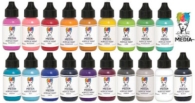
 I also added some Dina Wakley paint in 'Fuschia' and my go to 'black' and 'white'.
 
I love the grey I achieved by mixing.


To create the feathers, I used a Kinder Kreations Stencil.


I simply used a pencil to trace with the stencil directly onto the page.
 
I turned the stencil over to ensure the feathers were going in different directions.
 
This gives a more natural 'floaty' feel.
 
I then painted over them with the above paints.


I really just 'winged it' until I was happy.
 
I added dots, and once dry a few simple pen marks using my Fudeball pen.
 
I added a few flicks of the paint as well.


I then hand drew some little birds.....I wanted them to  look like they were coming off the feathers.
 
I added my quote in and done!!!
 
 
Time to share my second creation......
 
For this one I cracked open my Dina Wakley 8x10 Journal!
EEEEEEEKKK!!


This one began as I had a leftover scribbled flower from the last page I created.....
 
I couldn't waste it so.......


I firstly created a face using Scribble Sticks.....


I added water to the scribbles to allow the colour to drip down the page.


You'll notice I only created half a face.....
 
I can never seem to match up the eyes, so I cheated and added my quote to that section.


I used Ideaology alpha foam stamps by Tim Holtz and just added my own handwriting.


I then stamped a few of the Paper Artsy Tracy Scott  'Scribble flowers' above the face, in both the small and large size.


I added some Dina Wakley paint in 'Turquoise', 'Lemon' and 'Blushing'.


I love these pastel hues together.


This is the same technique I used last time, so you can see step by steps of that HERE.
 
I added the leftover flower from my last page over the top of some of the flowers and love that it sits up off the page a little.
 
So that's it from me today.....
 
I hope it's inspired you to have a go at our 'FLY' Challenge.


Just head to our Facebook Shares Group and upload your creation!
 
Let us know which Scrap Matrix Products you've used.
 
I can't wait to see them!
 
Colourful hugs,
xxx


Wednesday, 18 July 2018

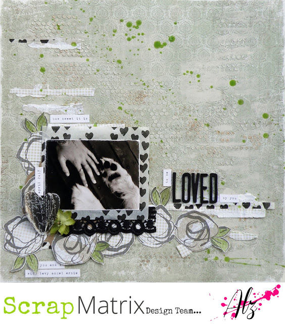
Loved .. with Alz

Morning peeps!

I'm back today to share my second project for the current Scrap Matrix challenge .. How Sweet It Is.
Loved

I was inspired by the yummy pistachio-ish green and vintage-y kraft colours, the love heart and, most of all, the song lyrics "How sweet it is to be loved by you".


I knew how I wanted this layout to look, but wasn't entirely sure I'd be able to translate my 'vision' to the page. So I started experimenting with, yet again, my favourite Dina Wakley Media stamp set .. Abstract Blooms. I didn't want the stamping to be 'heavy' so used a Watering Can (instead of Jet Black)  Ranger Archival Ink to do my stamping. I like the softer look the Watering Can gives. Once I had established that the stamped images looked good on the reverse sides of the yummy (pun intended lol) Studio 75 Yummy patterned papers (I used 03 and 04), I cut them out. I did try colouring a few of the flowers but decided I was right first time around, and left them plain with the kraft colour coming through.


Incidentally, if you like to create on neutral, kraft-like coloured backgrounds, I can't recommend the Studio 75 Yummy patterned papers to you highly enough. They are a lovely weight to work with, distress well, cut through like butter, and the colours on the other side (reds and yellows) are just as yummy (again, lol, pun intended) as the kraft coloured sides. I know there are more yummy (sigh lol!) kraft coloured papers in store, but for now, let's focus on the Studio 75 Yummy ones.  ;)

Next it was time to move on with my background. As I've said above, I was really inspired by the pistachio-like, green tones in the mood board. I'm not entirely sure why. I mean I know its Tammy's favourite colour, but is it mine?? I wouldn't say so, but this patterned paper by Maja Design (drool!) from the Coffee in the Arbour collection is to die for .. Feel the Grass (I'd much rather smoke it but that's another story .. did I just say that out aloud? oops he he he!). Why do I drool over the Maja Design patterned papers? First and foremost, their weight is perfect. Just heavy enough to carry a lot of mixed media, but not so heavy to be inflexible or rigid in your album. The patterns, whilst seemingly a little shabby chic/vintage, are generally delicate and work well as backgrounds. If the pattern isn't so delicate you're pretty much assured the reserve pattern will be. They also have a white core which makes distressing a breeze. If you haven't tried them out yet, you might as well pop a few into your next order. Especially as they're on sale at the moment.  ;)

Anyways, first up I used Snow White Colour Blast Paste over a 12x12 TCW Template (Tiny Circles).  Once dry, it was just a little too sparkly for my 'vision' so I randomly ran a brayer over my page and some of those raised tiny circles. In this instance, instead of my 'go to' white gesso, I've used a Paper Artsy Fresco Finish acrylic paint in Nougat. Although I left plenty of sparkly tiny circles, it now needed a little oomph. I got my oomph by using Metallic Rub Ons. I used the gold from Kit 4. So as not to get it spread all over the page, I placed my Tiny Circles 12x12 TCW Template back on top of my page so the raised tiny circles poked through. This enabled me to be quite precise in where I rubbed on the gold colour with .. wait for it .. my finger! So quick and easy.

see how it sparkles?
ps: I forgot to take a pic of the painted background before adding the gold 
so we'll just pretend for now that there is one here yeah?
applying the gold rub on
(couldn't manage to take a picture of my grubby finger actually doing this
and hold my phone at the same time!)
the finished background (or is it???)

So I'm reckoning right about now that I've finished my background. Buuuut I figured I'd go wash the gold off my finger and make a cuppa. When I came back to my page I realised it still needed something to lift it. My absolute favourite product of the moment came to the rescue .. irResistible Spray! I used New Sprout.

Done!

The next bit was the easy bit. Some layering, embellishing, final touches and Bob's your uncle. Well actually, he's mine, or was till he passed .. lived up in Mildura with Aunty Joan (who's still with us) .. a pretty part of Victoria .. darn hot though. 

Moving on ..


I ripped some small strips off the Studio 75 Yummy patterned papers and kind of randomly stuck them down, but so they'd flow. Out came my next favourite product of the moment .. Dina Wakley Media Tissue Paper. OMGee this stuff is to die for. Here, I found it positively perfect for layering, using little torn up strips like washi tape but not, and for cutting out shapes. For this page, I've cut out four hearts, stapled them together, and then ruffled them up a bit to create some dimension. I figured out where I was going to stick down my cut out Abstract Blooms, coloured the leaves green with a pencil from the Prima Watercolour Pencils Scenic Route tin, and added a small length of Vintage Lace 5 in black and a Petaloo craft brown Doily to my layers. I also tucked in a Petaloo Botanica Mini Pistachio flower and created my title with Black Fitzgerald American Crafts Thickers. Finally, as per usual, I printed my journaling with a free font I found online called 1942 report.

A few close ups ..


Did I manage to capture my 'vision'? Yep! Well mostly. I think. Most likely by the time I finished this layout I couldn't remember what my 'vision' had been, but at least it provided me with a starting point!

Now, don't forget that Scrap Matrix has changed the dates for its monthly challenge. Our challenges now run from the 1st of the month to the last of the month. So you have until midnight on the 31st to get a photo of your layout, or other project, uploaded to the Scrap Matrix Shares Facebook page. Please don't forget to let us know the products you've used which are available at Scrap Matrix.

Well, that's it for me today. I hope you're having a great July and enjoying doing your taxes!!

Cheers .. Alz  :)


Scrap Matrix products used:
Colour Blast Paste - Snow White
TCW Template - 12x12 Tiny Circles
irResistible Spray - New Sprout
Studio 75 Yummy - 03 and 04
Ranger Archival Ink - Watering Can
Vintage Lace 5 - Black

Tuesday, 12 June 2018

Capture magic .. with Alz

Morning peeps!!!

I'm back with my second project for the current Scrap Matrix challenge "The Point Is". I've been scrapping my doogles so much lately I figured it was time to throw in a layout of my beautiful niece Mia ..

Capture magic

Of my many nieces and nephews, I'm probably closest to Mia. Maybe because she's as doogle crazy as I am? Anyways, this is Mia with Levy. If you're looking for Levy, just find Mia. You know how it goes .. if you're looking for Mia, just find Levy! Whilst I could wax poetic about Mia and Levy til the cows come home, I should probably give you a refresher of the current Scrap Matrix challenge ..


I had a lot of fun creating this page. A bit of work on a patterned paper background, some layering and embellishing and it was done and dusted. It only took about three weeks. Ha ha! Three weeks?!! I know right?! Life has been so extraordinarily hectic lately I've had to grab five minutes here and there to scrap. So frustrating. But for a greater purpose, so I no complain. The greater purpose? Hubby is retiring and the countdown to R Day is on. Don't worry, I know what you're thinking. For the record, I'm much, much younger than he is lol. But yeah who knew there would be so much to organise. Appointments, phone calls, meetings, paperwork, phone calls, more paperwork. Its all so very exciting though and in not too many weeks I'll have him home, home for good, and I can not wait!!!!! What's the point of sharing this I hear you say. No reason. Not really. Just chatting with you and digressing. A bit. As I do. Does there always have to be a point? Well I guess in this context maybe. So ..

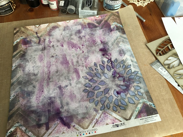
My background is pretty much a recipe I follow when creating on a patterned paper background ..

start off with a piece of patterned paper (obviously duh!)

apply white gesso with a brayer to tone it down a wee bit

figure out around about where my pic will go
 bringing the TCW 12x12 Mums stencil into play because I love the pointy petals

and applying Paper Artsy Fresco Finish acrylic paint in Wisteria with a sponge
then outlining the pointy petals, somewhat messily, because I like messy, with a Fudeball Pen

sanding it back, all the better to absorb Lindy's Starburst Spray
in Tea Pot Purple

and finally adding some black texture paste through TCW stencil
(12x12 Sketch Grid)
and using a Jet Black Archival Ink Pad to stamp some pointy triangles
with an Aall and Create stamp (#10)

When I'm happy with my background, I usually build up some layers to go behind my photo. Not always. But usually. It depends really on whether I want my background to be an extension of my photo or to enhance it. I guess. What about you? When you create a mixed media background do you use layers behind your photos? Anyways, in this instance I felt the need, the need for layers.


FYI .. the lace isn't tattered! I deliberately cut into it to make it a bit frayed and grungy.  ;)

After fiddling with the layers a bit, it was time to actually stick the photo down, add some embellishments, a title and the journaling.

Here, I've broken down a large Curly Rose in Cream. I'm trying to create less bulky pages, but then I went and put a bulky-ish white rose from the Blue Fern Studios Heartland Roses and Blooms pack in the middle so that kinda defeated the purpose of pulling the large Curly Rose apart. Sigh. lol.


I've used various paints, including a Dina Wakley Media acrylic paint in Eggplant, for a bit of pop and contrast, on a couple of large Antique Silver Feathers. An Um Wow Studio Flair from the Teal Bloom pack almost finishes this embellishment cluster.

Except that I also added a Kinder Kreations chipboard feather which I painted with Violet 13 Arts Splash Glitter Ink. I was super inspired by Debbie Pulford's use of the Glitter Ink in her Guest Design Team post of 1st June 2018. Thanks for those tips Deb! Oh and I slotted in a couple of green wires I pulled off from the Curly Roses. In the past I used to throw them out but now I reckon they make great 'embellishment cluster fodder'. 


When I was ordering my supplies for this layout, I knew I'd want to cut out some shapes (most likely, triangles for arrow heads) but I didn't want to cut into a 12x12 sheet of patterned paper for, quite literally, some triangles. Instead, I ordered the 6x12 Die-Cut Elements from the same range as my patterned paper background (7 Dots Studio Northern Lights). The 12x12 Tags would have worked equally well, especially if you like tucking tags in here and there. 

Anyways, I'm probably showing my age with this next bit lol, but did you ever have a Math-O-Matt in school? I did. It was a bit of plastic with cut out geometric shapes, measurements and stuff. I never threw mine away. Heaven only knows why lol! These days I find it quite handy and in this instance, I used one of the triangles to outline which of the 6x12 Die-Cut Elements I was going to cut into.

pretty cool huh?

I sanded the edges of my triangles and added them to my layout in groups of three. You may have noticed that I sand pretty much every edge of pretty much everything. Its that 'one thing' I do. Do you have a 'one thing'?


Lastly, my title. Again, I've used the Tim Holtz Idea-Ology Chitchat Stickers Verbiage which I stuck with foam tape to one of the banners from the 6x12 Die-Cut Elements sheet. I also used foam tape to stick that onto my layout, just to give it a bit of definition. And that was that!


That's it for me today. You now only have a couple of days to get your entry done and uploaded to the appropriate album on the Scrap Matrix Shares Facebook page. Entries are due by midnight, 14th June. Please don't forget to let us know which of the products, available from Scrap Matrix, you've used. Its such a pleasure to be inspired by others' creations.

Wishing you happy scrappy days.

Cheers .. Alz   :)


Scrap Matrix products used:
7 Dots Studio Northern Lights - 6x12 Die-Cut Elements
TCW 12x12 Stencils - Mums and Sketch Grid
Lindy's Starburst Spray - Tea Pot Purple
Ranger Archival Ink - Jet Black
Embossed Paper Lace - French Lace Black
Vintage Coloured Lace - Gabrielle Lilac
SaveSaveSaveSave

Monday, 4 June 2018

Lynn's second project for this months challenge

Hi everyone, Lynn back again to share my second project for this months Challenge - "The Point is".

I have created an art journal page:


and here is the moodboard -


I have taken inspiration from the bottom right colourful triangles and the star.

I began by cutting up scrap paper into triangles and gluing them to my pages.


I filled in any gaps with a selection of washi tapes.  I have then cut out some triangles from scrap cardboard to use as a template and coloured all the areas around them using Gelatoes.  The white arrows were created using the Dylusion Arrow Stencil and Dina Wakely Paint in white.  The black circles have been created using a lid and black ink


The small triangles are an AALL and Create Stencil # 20 and black gesso.
Final touches included stamping the words using the Visible Image Stamp - Own It, and the title using a Faber Castell Pitt Pen and white sharpie for doodling.

Here are some close ups:


Thanks for stopping by and I hope you get a chance to create a project - scrapbooking layout, art journal page, tags, a card or tw, using the moodboard for this months challenge.  All you need to do is put a photo of your project into the relevant album on the scrap matrix shares facebook page detailing at least one product that you have used that is available at the Scrap Matrix Store.

Products Used


Til Next time - Happy Crafting